Apple’s iPhone may not be getting a significant AI upgrade, but it is getting a fresh coat of paint. As are Apple’s other operating systems.
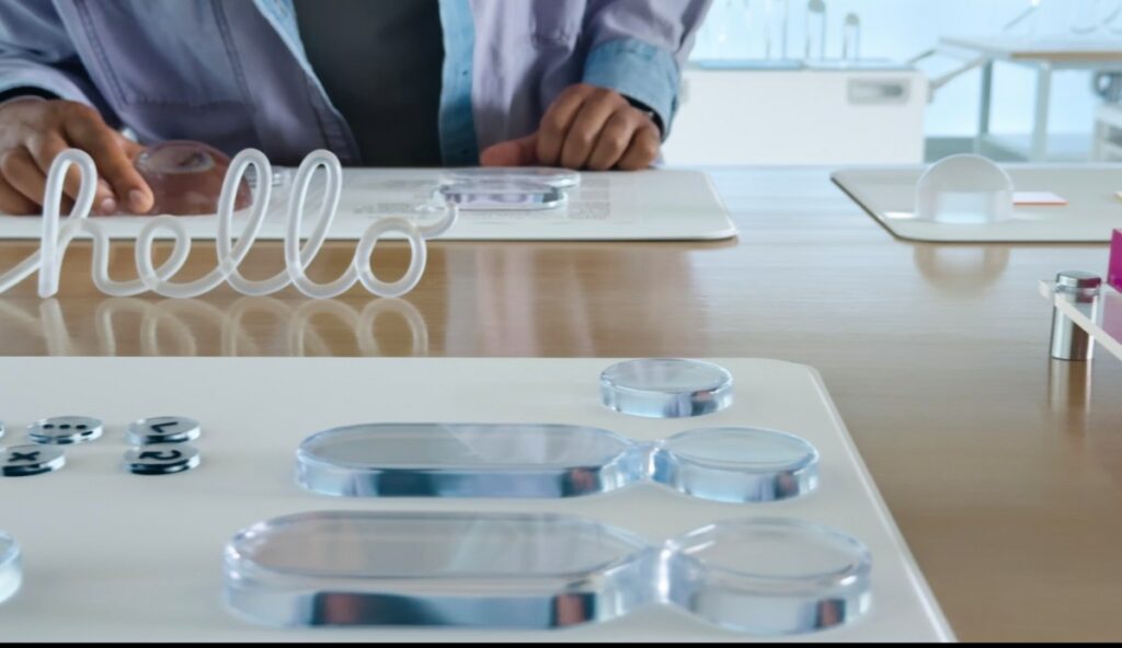
At Monday’s Worldwide Developers Conference (WWDC 25), the company announced a refreshed user interface called Liquid Glass, which features shiny, reflective, and transparent visual interface elements that give the software a more “glassy” look and feel.
The design refresh is inspired by Apple’s VR headset, the Vision Pro. It unifies the iPhone’s design and that of Apple’s other devices, with the interface built for the spatial computing headset. This change could also hint at a potential future that could see Apple’s operating system and software extended to other surfaces besides phones, tablets, and watches — like AR glasses, perhaps.
Introduced at WWDC by Alan Dye, Apple’s Vice President of Design, the Liquid Glass interface represents the biggest visual update to iOS, the software powering the iPhone, since the move from the original skeumorphic design to a flat design style in iOS 7.
With skeumorphism, the idea was to translate real-world objects to the touch screen — like a Notes app that looked like a yellow legal pad. Flat design upended this visual language, opting instead for simple shapes, clean lines, a minimalist user interface, and more colorful icons.
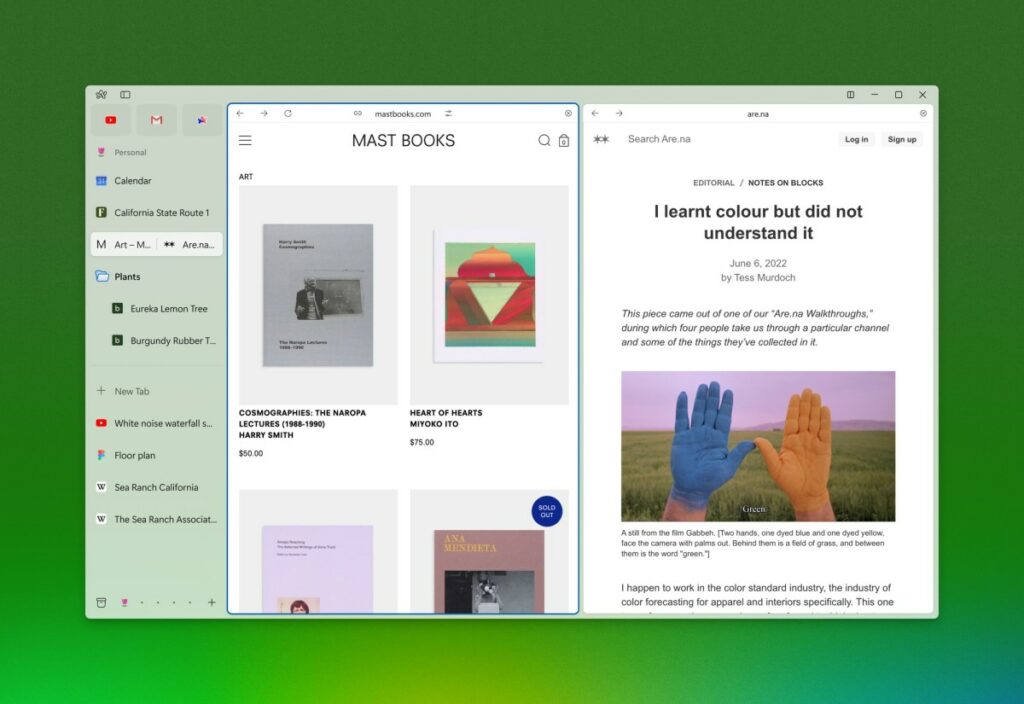
Over time, iOS’s flat design evolved to have more glossy and semi-translucent layers, like a Control Center that mimicked a frosted pane of glass.

As Dye explained, the redesign includes the “optical qualities of glass and a fluidity that only Apple can achieve.”
The company says the update will bring more clarity to navigation and controls, refracts light, nd dynamically reacts to your movement. In addition, it will respond in real time to your content and your input, creating a “more lively experience,” Dye said.
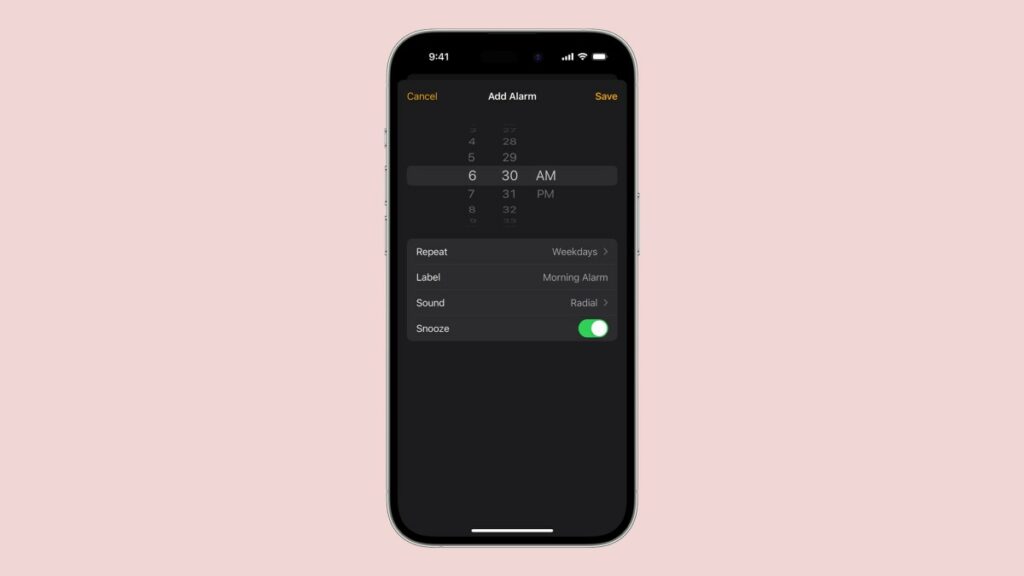
The Liquid Glass display is translucent and will behave like glass in the real world. The color of the screen is informed by your content and will adapt between light and dark environments. In addition, alerts appear from where you tap, context menus expand into a scannable list when you scroll tap.

The design applies to both the system experiences like the Lock Screen, Notifications and Control Center, as well as the app icons. The company says the new icons will look like they’ve been crafted with multiple layers of liquid glass and will come in light mode, dark mode and a new clear mode.


