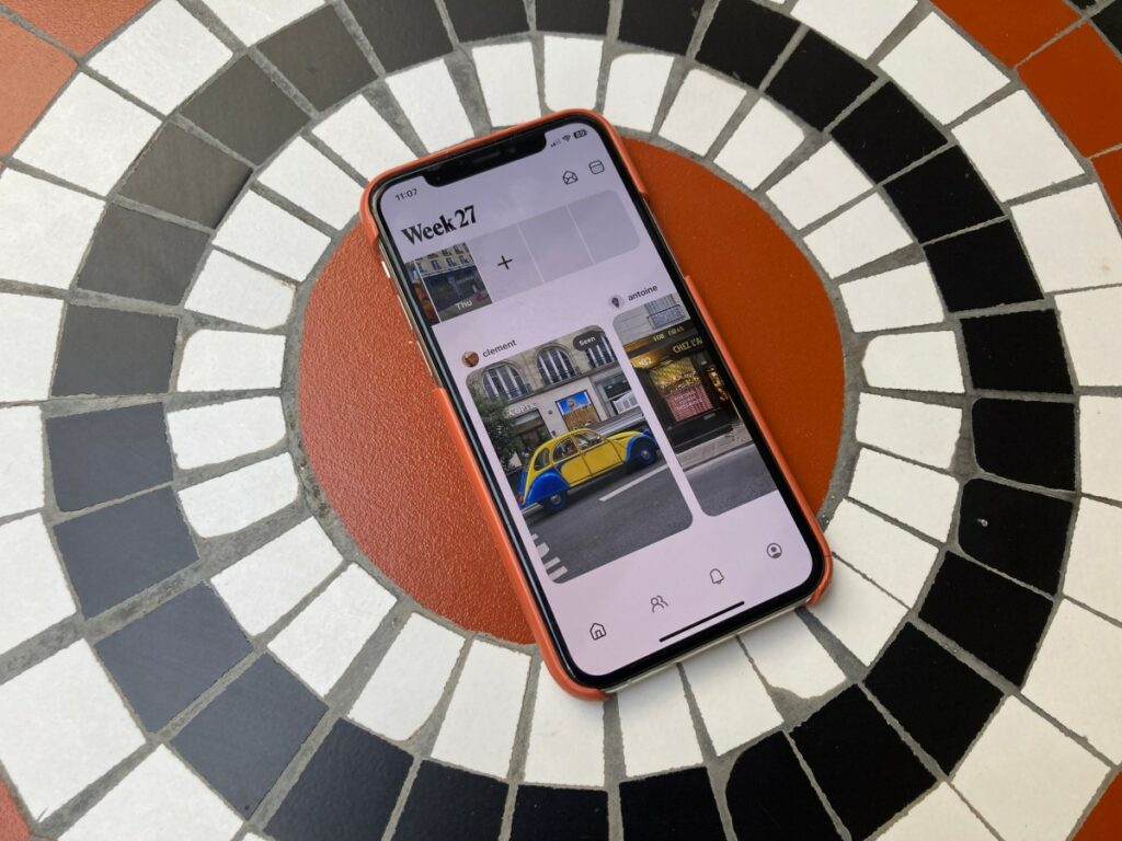
You know you’ve made it as a startup when the big tech companies start ripping you off. That appears to be the case with Retro, the popular photo-sharing app that’s gained a following among those who appreciate the ability to share photos and videos more privately with friends and family. The company was recently caught off guard by a post on X (formerly Twitter), which offers a first look at a new Google Photos feature called “My Week.” Unfortunately for Retro, the feature looks a lot like its own app for photo-sharing, as it also encourages users to take photos to document their days, which are then showcased in a week-by-week format.
Retro co-founder and CTO Ryan Olson reshared the post circulating on X with a comment, “feel like I’ve seen this somewhere …” along with the inquisitive face with a monocle emoji.
The X post detailing the new Google Photos addition links to Android Authority’s APK teardown, which digs into the Android app to find possible upcoming changes. The site was able to switch on the My Week feature, suggesting a public rollout could be coming soon.
According to its findings, Google Photos will add a new “Introducing My Week” tile to its existing Memories carousel, which will include a setup wizard that helps people select the photos from their week that they want to share. Users can also invite others to view their weekly memories, similar to how Retro lets people invite friends to its app for the same purpose.

After setup is complete, the photos selected by the Google Photos user will show up in a dedicated card in the Memories carousel, the blog said. Users can also tap on the card to add more photos, view those shared in previous weeks, and message their contacts.
In other words, Google has taken much of the Retro app experience and turned it into a feature to add to its larger Google Photos product.
Reached for comment, Google didn’t speak to the similarities between its My Week feature and Retro, but it did confirm that My Week was something the company was experimenting with. “We’re always experimenting with new ways to help people reflect and share their memories with the people that matter most to them,” Google spokesperson Michael Marconi said. “We’re looking forward to getting feedback on My Week but don’t have anything else to share on future availability.”
Retro CEO Nathan Sharp isn’t worrying just yet about Google’s plan to copy his app’s experience, despite the numerous similarities. However, he noted that in addition to making the user’s week the main unit for the photo journal, Google Photos’ design also looks a lot like Retro. Like his app, the Google Photos journal is displayed in a horizontal “filmstrip”-style format, with rounded corners on the outside.
Still, Sharp said, Google’s product is not yet public and could change.

“We’ve worked inside of big companies as well, and we know that a lot of there’s a lot of testing going on inside, and oftentimes those are rough and they change dramatically before they ship,” Sharp said. Before building Retro, he and Olson — the co-founder of Retro’s parent company, Lone Palm Labs — had worked together at Instagram and understand what it’s like to be on the other side of things.
“At first, when you see this, it does make you a little angry, because it seems like some things are lifted one to one. But … this isn’t what they’re shipping,” he explained. “They aren’t asking to be judged on what’s on Twitter today. So I have to kind of step back and say, this is probably a team in progress.”
If the feature does ship, Sharp says he won’t underestimate Google’s potential to compete in his space space, “potentially with the same exact designs.” But he does think Retro users may appreciate that the app serves a specific purpose — that is, one that’s dedicated to catching up with friends and family.
That he, says, is very different from an app you use to store “every single photo and screenshot you’ve ever had,” as well as edit those, and free up storage space on your phone, which are the primary use cases for Google Photos.
“One of the things with Retro is that we have a unique approach — both to the product but also the ethos of things,” Sharp said. “On Retro, your photos are incredibly private. We don’t we don’t sell or rent or user data to anybody. We aren’t an ad-driven model. We don’t have a public feed of people that are trying to build audiences, so you don’t run into distractions outside of family and friends. We don’t train AI models on any of your photos. I think the simplicity and the focus of that still helps us differentiate from any kind of bigger multi-use case app.”

Retro continues to push out new features to cater to this audience, as well. It launched collaborative journals and the ability to send photo postcards directly in the app, even if you don’t know your friend’s address. Instead, the app will simply prompt the friend to enter their address to receive the postcard, but the address itself remains private. Plus, on Android, users can now send postcards directly from the camera roll itself. (And because Retro hasn’t yet built out the payment flow, the feature is free to use.)
The startup is also working to bring its widget to iOS, which would allow users to customize their iPhone’s Home Screen, and it’s developing a feature to enable direct sharing with “keyholders,” or people who’ve been given access to a user’s entire photo archive, not just photos from the past month.
Eventually, Retro will look to monetize by offering a premium subscription, but nothing has rolled out on that front as of yet.


